Dwarf Paladin Process

Lately I've been working in photoshop more then usual to improve my digital skills as well as color theory. Over the past 2 weeks, I've colored a large amount of character drawings and about half way done with my new full illustration. The other night while sketching, I drew an interesting Dwarf character that I knew I had to bring to life as a colored design. I created a step by step process tutorial of each major step that went into creating the final illustration. dwarf_process_internet

Here's the final image on it's own.

Dwarf_Paladin_color_internet_fin

Overall I'm pleased with how the paladin looks in the end and I learned new ways of approaching color with this piece. Now to take a similar approach into my next illustration.

Process of Fungus Behemoth

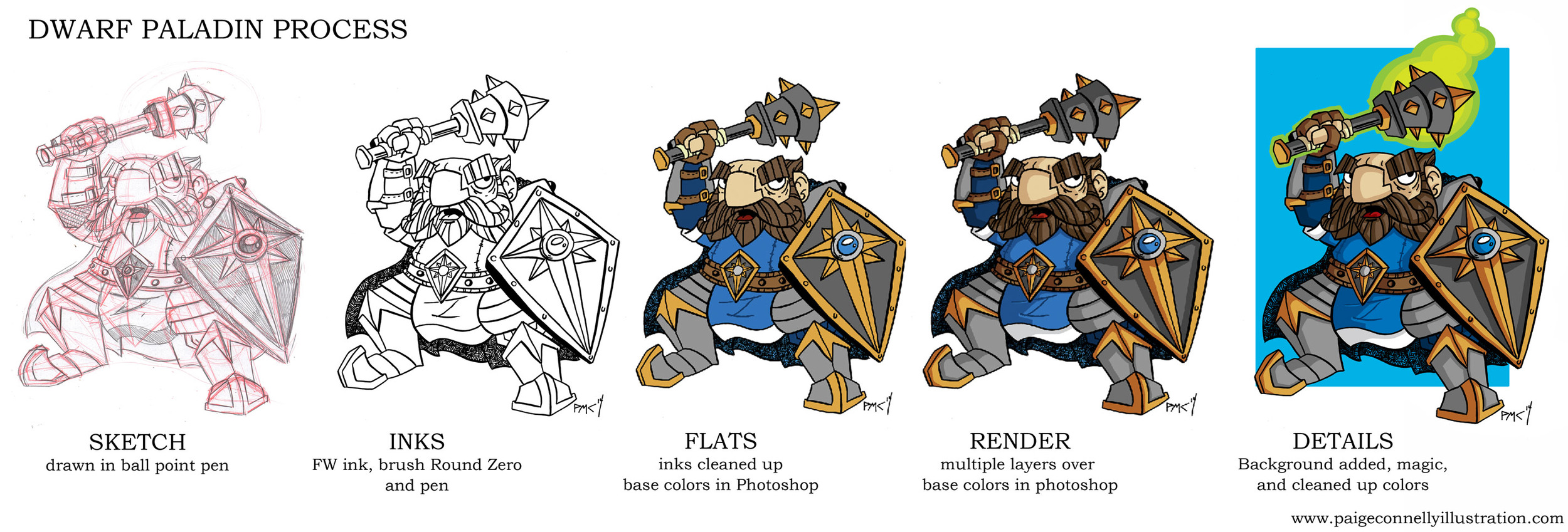
Haven't done a process post in a while, and don't think I've ever shown how I digitally color. Starting a design or illustration always starts in a sketchbook or on random straps of paper. The Fungus Behemoth started a while back in my last sketchbook. fungus_Sketch

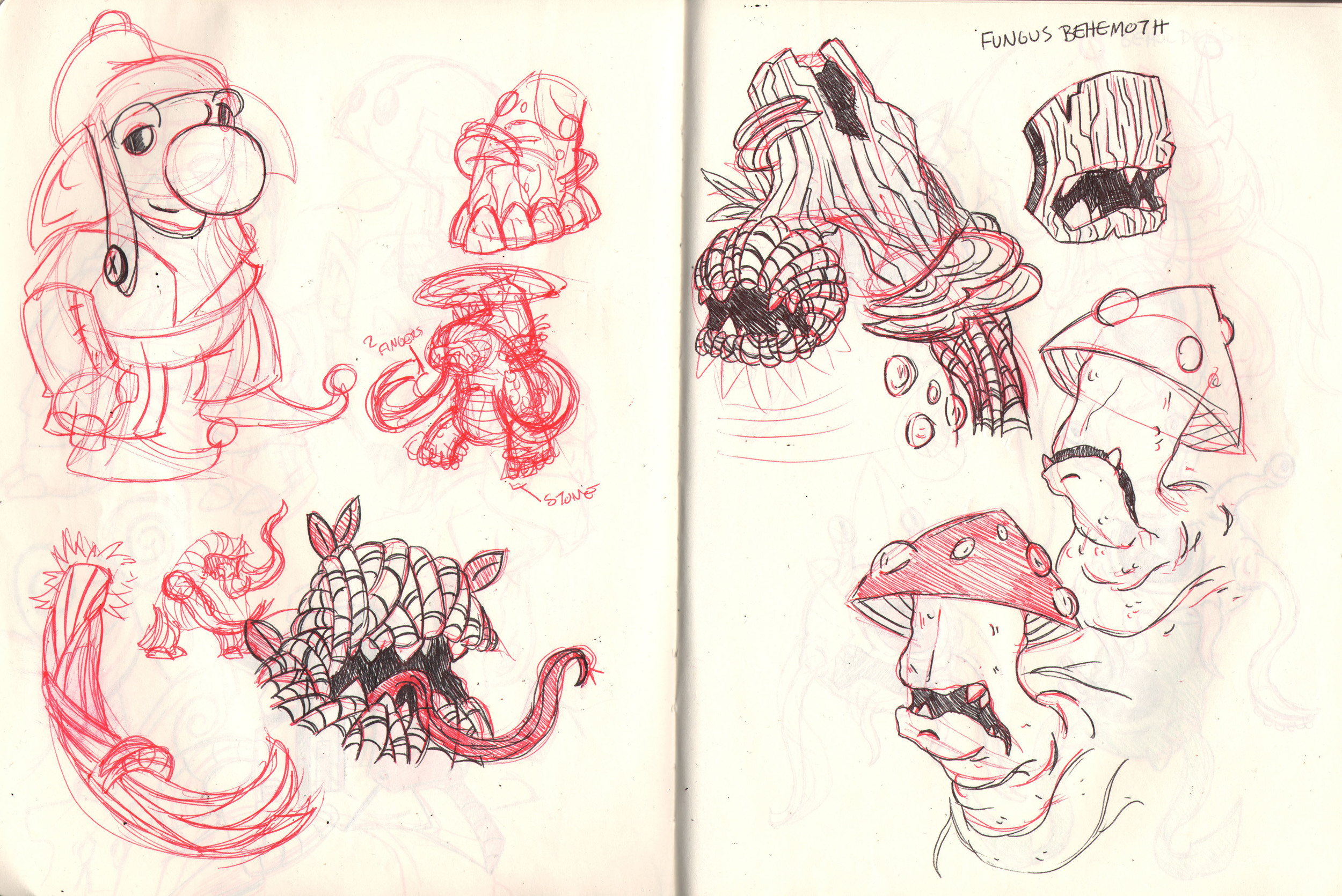
I like to sketch in ball point pen, the one thing that always bothered me about pencil is that it smudged everywhere and made a huge mess and I always forgot a pencil sharpener when I needed it. Ball point pens are usually easy to find, even if I forget to bring a pen with me. I start out sketching in red pen then add details and clean up the shapes with black. There's a small sketch of the Fungus Behemoth on the left of a pose and design. Then I experimented with what the face should look like. And in the corner of the page is a little Brownie randomly crashing the party.

Then I'll take the ideas I like, sketch the design and ink it. I always ink with a brush, sometimes I'll use a pen for some details but not often. Like I've said in other posts, FW ink is what I use and will always use. Watery Ink is not my thing.

Screen shot 2014-10-26 at 10.57.14 PM

Next, I scan the ink drawing. I have a Scan Express Pro scanner, it can scan up to an 11 by 17 drawing, which is nice so I don't have to stitch multiple scans together saving time. I'll clean up any random ink and pencil that is scanned before I start coloring. Using multiple layers in folders, I create the base for the piece.

Screen shot 2014-10-26 at 10.57.27 PM

Most of the time, I have an idea of the kind of color palette. But I like to experiment before I settle on the base colors for a piece. Since the Fungus Behemoth lives in swampy forests, it helped flesh out the colors. I try not to use to many colors so it doesn't look like a box of crayons threw up on my drawing, limited colors are better (for me).

After settling on base colors, I start to render the monster. Most people say render as in adding layers of value to create a more realistic look. For me, I am doing the same but not in an ultra rendered way of smooth gradients, more graphically for my work.

fungus_creature_color

Laying in the shadows can be easy sometimes and challenging most times. Adding black to the base color does not create interesting shadows, shadows are color, light is a spectrum, and just because I don't render photo realistic does not mean I don't take the physics of light into account. On the top layer, I'll draw lines that show where the light is coming. After laying in the shadows and experimenting with colors for the shadows, I place color on the base that the creature stands on and add a cast shadow.

Currently I am juggling a few monsters in photoshop at various stages for a personal project in the works. The Fungus Behemoth is a part of it as well. But more on the personal project another day.

My Tools for sketching

Since I have been showing many final drawings as well as digital pieces, it's time to show my main tools for sketching.

Image


Sketchbooks are the most important record of my thoughts at a given time. I've had a sketchbooks since I was 11 and never stopped carrying one around with me where ever I go. My current sketchbook is the large yellow one, I stopped using the brown paper sketchbook since I couldn't find a low enough price for my budget. I spent about 8 bucks on the yellow sketchbook. With cheap paper, you don't have to worry about making awesome drawings and just experiment. Last week, I bought a moleskine, sometimes carrying my large book is an annoyance so I often carry it in a bag when I leave the house. The moleskine is nice because its a good size to carry around. The paper is thin but it has a lot of paper so I'll get my moneys worth in it.

Some pages from my Moleskine.

Image


Image


Next are my supplies I use to draw in my sketchbooks with. 

Image


I like to sketch in pen, it makes me learn to place confident lines on the paper, plus I have a record of everything I draw since there's no erasing.  The pens on the left are 2 Pentel Finto in black and red, the other pen is a sharpie pen. The pentel's are very similar to sharpies but move better across the paper (tip: use on thick paper only, it will bleed through very thin paper). The 2 pens I use the most are ballpoint pens of red and black. The red pen is for laying down the under drawing and the black is for cleaning the sketch up and adding details. To the right are the 2 pencils I use when sketching final pieces. The larger blue pencil with the metal is a Pro-Matic, it holds a stick of graphite and it's great for gesturing a large piece. Since I leave a flat tip, it keeps me from getting ahead of myself with detail. The other pencil is a basic mechanical pencil and a trusty easer near by. 

Image


For inking I use FW Ink, I haven't found any other ink that lives up to FW's standard. I ink my pieces with Burnt Umber to give the drawings a warmer line. The white ink is FW as well and I use to for my toned paper pieces, it's great because it won't warp the paper because there's no water added. My favorite brush to ink with is Blick Studio Synthetic 0, I've experimented with many brushes over the years and can't find a brush I enjoy more then the Blick brush. Each brush has a color tape at the end to remind me which one is for white ink and what's for the umber ink.

That's it for my drawing supplies, later on I might do a post about my favorite paper to use in the creation of illustrations. 

PORTFOLIO

Process Post- Goblin Climber

During Goblin Week I drew a mining goblin repelling in a crystal cavern. It was my favorite drawing I created that week and decided to take it to a finished piece and documented the creation of the illustration while working.

Image

The theme I added to Goblin Week was to create a mining company. In the beginning it's all little drawings of poses and ideas. It helps to layout the shapes before deciding details. Sketchbooks aren't meant to be pretty so I scribble down any idea that comes to mind even if it doesn't end up working because it might be useful later on. After sketching the repelling idea on the left page, I took the idea and scaled it up to a larger sketch. Then I took that sketch and cleaned up the idea on a piece of bristol to prepare to ink.

Image


Having a solid drawing makes inking much easier. I don't leave anything blank to 'fix later'. It always ends with taking more time to fix later then just doing it right the first time. I get out my lining brush and ink bottle and get to work. After doing the first ink pass, I let it dry then tackle detailing. When the piece is completely dry, I scan it and clean up any mistakes or random ink blobs to prepare it for digital flats.

Image 

The cleaned up ink drawing becomes the lines for the digital piece. In photoshop the base colors are laid down on multiple layers, this is the time I experiment with different palettes. I want to nail down the palette before I end up adding shadows and highlights. But that doesn't always happen so I adjust some colors. For this piece, the character came together easily but the rocks and crystals had a lot of experimenting. 

Image


The final step in to add the highlights and shadows. Those are also done on their own layers in a new folder. Labeling layers and folders makes it much easier to keep track of things for me. After adding shadows, the highlights come next. Since the back of the crystals are black, I added a strong purplish white highlight to add punch. 

I'm still learning how to use photoshop more efficiently and am enjoying learning to use photoshop as a medium. Though I am experimenting with new ways to apply watercolor in a flat manner similar to my digital work. More pieces are in the work.

Making of Goblin Traveler

An illustration, for me, always starts with an idea. It doesn't have to be earth shattering but has to have enough content to create an image. During the Hurricane in late October/ early November, I wasn't able to work on any of my school projects. So it was a create time to catch up on some personal work. In my sketch book I drew this goblin.

by Paige M. Connelly

This sketch was created after a few pages of drawing expressions, poses, and props. I like to have a collection of references I can look at when I create a sketch for a painting. Most of the time they are my own drawings, but sometimes I use photos of things I've never seen before so I know that it will be drawn correctly.

After the sketch is done, I use a light box to trace the image onto watercolor paper. Light boxes help reduce the time of transfering the image, I don't want to spend 2 hours redrawing the image on a sturdier surface. Next I ink the sketch.

by Paige M. Connelly

Many people ink with different things. I have used pens and nibs, but I like to use a brush. The brush I like is a synthetic round 0, its small, nimble, and can create varied line weights. My favorite ink to use is FW, I use nothing else. FW gives true black lines, it doesn't fade to gray and is waterproof. Let it dry for an hour, while setting up to paint.

For my watercolors I use Winsor Newton. It's better to spend money on tubes with good pigments then to waste money of cheaper brands with little or bad pigments. I haven't had to buy a new tube in 2 years, as long as a palette is used, its easy to save and reuse watercolor.

by Paige M. Connelly

This is the illustration after I have built up enough pigments to create a base layer that I will then render on top of. I don't let alot of the paper show threw my paints. I like a more bold painting style. The basing can take a while. It's all about waiting for layers to dry in order to build up a layers so its flat and even. But most importantly patience.

by Paige M. Connelly

After rendering on top of the base coats its finished. Once again this involves lots of patience since building up solid layers takes awhile. I spent a few hours on and off the piece to make sure the paper is dry before creating a new layer. A good way to save alot of time is to use a brush that is proportional to the are you are painting. So in the beginning I start with a large brush, then moves to a small brush at the end when I am ready to put down a high amount of pigment to a small area.  Now I have a finished portfolio piece, this personal piece was started in October of 2012 and finished in January of 2013.